We hit a milestone recently when we finished animating our first character for Tahira. The Claw animations consist of 480 drawn key frames, which took our dedicated artist Peter Simpson a month to do. I’ll be detailing the process in another update at some point in the future, but for now enjoy some rotoscoped 2D animation.
We dressed our friend Matt up as our barbarian character and asked him to act out the different moves we needed. He did a fantastic job, but we had a bit of trouble getting the death animation right, as you can see in the video below. But on the upside, I was given the perfect footage to score with some of the beautiful and frantic music from Amelie.
Watch on for hilarity.
Welcome to 2014 everyone! We’re back in the office and working hard. To start the year off we’ve got a new animation for you.
Watch Peter C hamming it up for one the Claw’s death animations.
This was the final test in our animation pipeline. We learnt some big lessons, which I’ll go into more detail on in another article. There were two big changes we made after running this test. The first was making a concerted effort to make sure the action in the reference footage looped back to its starting point. All of our animations need to loop and it saves a lot of animation work to have that done in the reference footage rather than in the animation process.
The other big change was moving to using a 3D head and 3D sword instead of using the reference footage. It proved very time consuming for Peter to have to make up the head shape and guess the angle of the sword. Instead he modeled a head and sword and then tracked them into the reference footage. This added step takes a little bit of time but saves far more than it adds.
Welcome to Creating a Game Character for Tahira: Echoes of the Astral Empire. In Part One: We discuss creating a character from scratch and walk you through the process we used to refine that character into a production ready concept.
Introduction
Hi, I’m Peter Castle, the Lead Writer at Whale Hammer Games. We’re five months into the development of our game, Tahira: Echoes of the Astral Empire, and so far we’ve had a lot of fun bringing the game’s characters to life. As we move from pre-production into production we wanted to share that process with you.
Bear in mind that everything I’m discussing is a work in progress and it’s likely that parts of it will change as we continue to develop the game.
The Written Concept
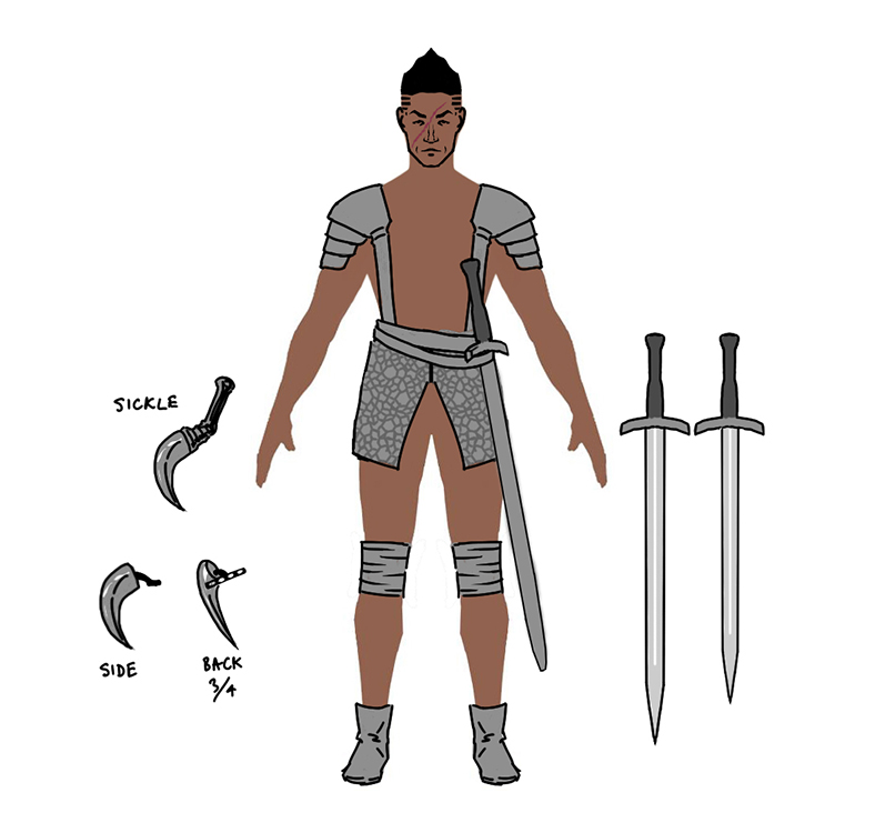
Tahira: Echoes of the Astral Empire has a strong narrative component. The first step in the character concepting process is for me to work out the basics of who a character is and to identify any key pieces of visual information that our Lead Artist Peter Simpson needs to get started. That information usually consists of things like gender, age, race and in the Claw’s case, his scar.
The Visual Concept
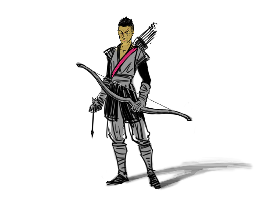
Peter takes that information and spends some time working on his interpretation. Once he’s satisfied, he shows me and we bounce it back and forth until we’re happy with the result. Somewhere in that process (it varies) we sit down with our Designer, Tom, and decide what combat role the character will fill. You’ll see in the first two concepts below that the Claw was initially drawn as an archer. The combat role decision is usually informed by the personality and history of the character as well as the needs of our combat system.
In the Claw’s case, Peter nailed the facial features on the first go and we moved straight into concepting the clothing and gear.
Original Claw Concepts
Clothing and Gear
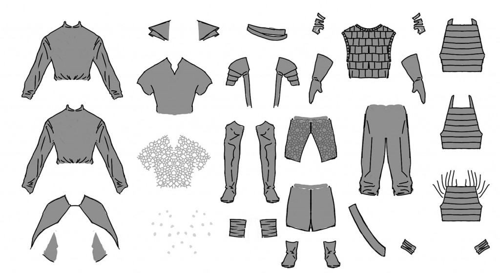
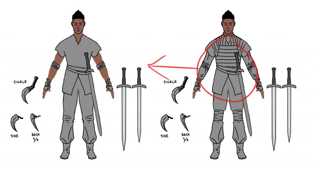
Peter spent some time iterating on the Claw design so we had some options to choose from. We are always trying to find a design that conveys key information about the character to the player visually rather than needing that information to be explicitly stated in the written narrative.
This Isn’t Real Life
One of the things we had to consider when we put together his clothing and gear was what the player would actually see in the game. It’s all very well to look up your favourite fantasy and medieval TV shows and movies for clothing reference, but when your character is only a couple of centimeters in size you quickly find that anything with too much detail doesn’t work.
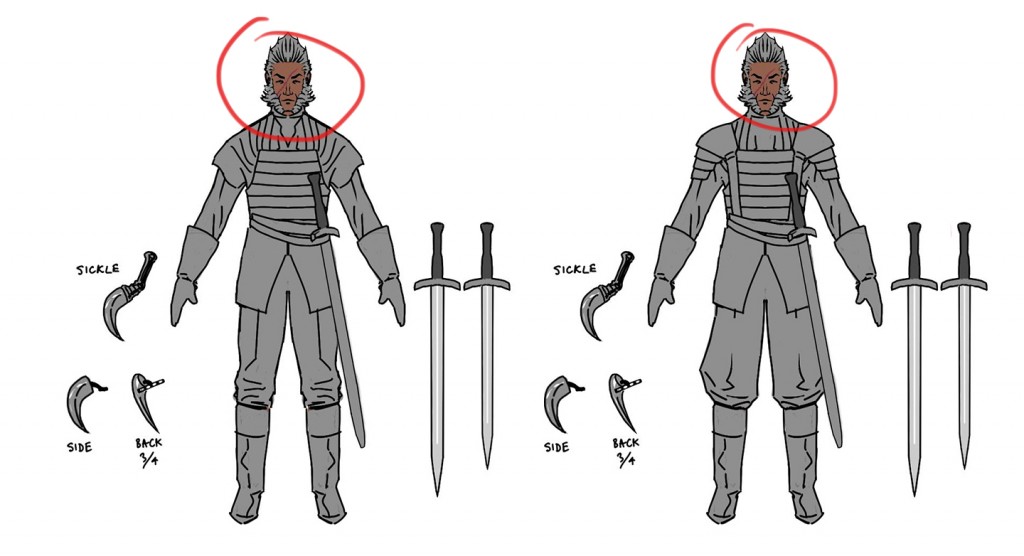
The Hair Conundrum
We liked the Wolverine-esque facial hair on the Claw, but decided it didn’t fit with the character’s vanity.
Some Designs Were Deemed a Bit Risqué
Practical and Dangerous
Peter scoured the web for all kinds of medieval and fantasy clothing. In the end we kept coming back to practicality. Characters like Jorah Mormont from HBO’s Game of Thrones have that mix of stylish but practical looking clothing and equipment and that was something we wanted to capture.
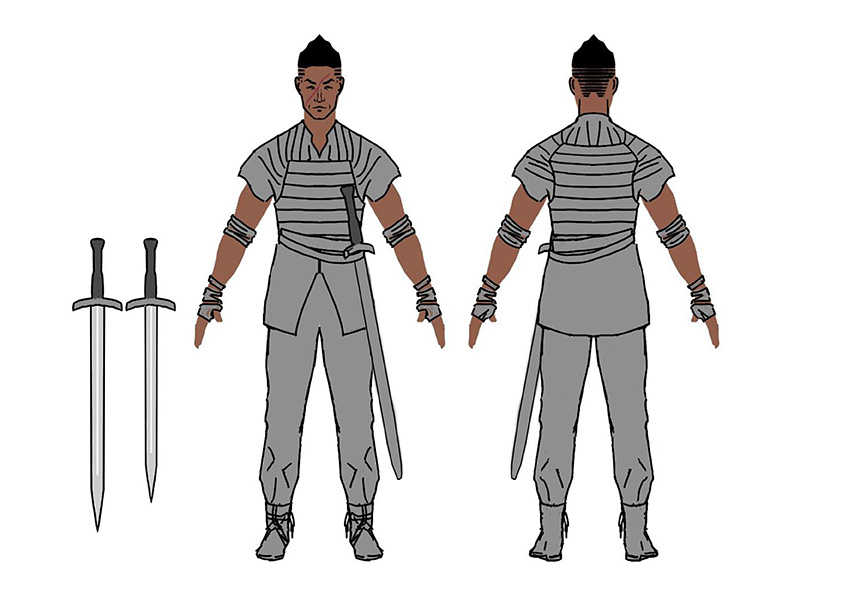
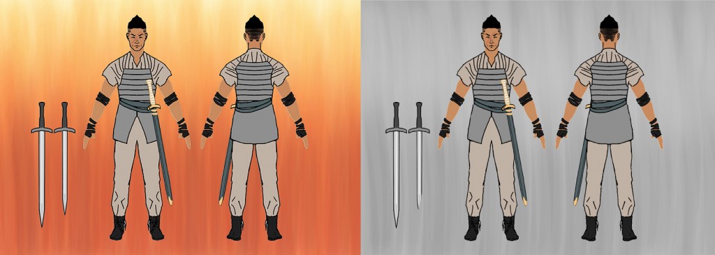
The Claw is a travelling mercenary, always on the road and ready to fight at a moment’s notice. The comfortable shirt and pants combination makes sense for someone who spends a lot of time in the saddle. We liked the heavier armour, but decided to use the light armour as it fits with the Claw’s personality and combat role in the game.
Final Concept
Colours
There are a number of factors we consider when we sit down to colour.
1) We need to create an interesting colour scheme that fits the character and the world.
2) Test that colour scheme against likely background colours.
3) Test its readability when you have a lot of other characters on the screen at the same time.
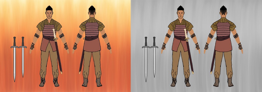
We’re still quite early in development and colours are something we’ll be spending a lot more time on later in the process. For now though, we played around with a few different schemes and found a couple that we liked.
Generally we find it easier to do something roughly, even if we aren’t going to use it. That means when it comes time to do it properly we can iterate rather than starting from scratch. Thankfully our colouring workflow means that any time spent on the colouring now will save time later in the project. I’ll go into this in a lot more detail in a future post.
If you’re looking to get started with colour, there is an excellent guide that Valve has put together on colour theory for Dota 2. You can view it here.
Colour Scheme Ideas
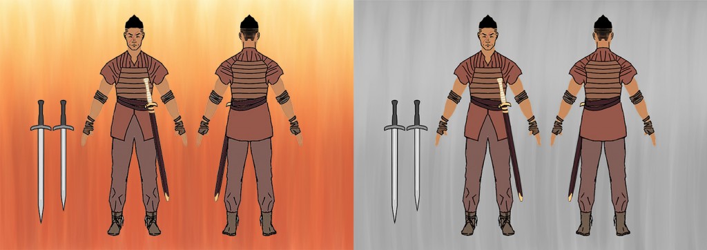
Final (For Now) Colour Concept
We were a bit surprised by how readable grey and beige are on a grey background.
Final Thoughts
That wraps up part one. If you have any questions or insights into the development process fire away in the comments.
In Part Two, we will take the Claw concept and begin the process of turning him into an animated character.

